The human brain processes images 60,000 times faster than text. As a matter of fact, visuals speak louder than words. And why not, visuals can improve learning by 400%.
“Let me ask you this, how many brand logos do you remember?” The logos that popped into your head just hit the bullseye by triggering the right emotions on the spot. This was because of using powerful visuals leaving uninspiring and tedious ones behind. For other brands- it’s time to let brand heritage Rest In Peace. Let’s unravel the psychology behind the brand’s logo – A “Real Deal Breaker”.
Before that let’s get today’s reading vibe going – Why don’t graphic designers tell jokes? Because they prefer to show them in a visually compelling manner. Likewise, if you don’t pay attention to the following sections, your logo might become the next visually compelling joke of the century.
What could go wrong?
“First Impression is the last impression.” This is not true in each case, but do people care to give a brand a second chance with such massive options around? A logo is a first impression of a potential customer. Losing a customer could only be a bad logo away!
What Not to Do!
Typography
Why settle for just the bare minimum when you can turn your text into a pretentious, overanalyzed writing piece?
Typography is the art and technique of arranging type (letters, numbers, symbols, etc.) to make written language not only readable but also visually appealing. Typography involves careful consideration of several elements like font choice, size, line spacing, letter spacing, alignment, and how all these pieces work together to enhance both the functionality and aesthetics of the written word. Let’s understand the importance of choosing the right font.
Choosing the wrong font could make people lose interest in your brand. Imagine a classic serif font for a Toy company logo or an amusement park, won’t that take all the amusement out of you? In a competitive market, having a weak logo could put you way behind. The logo font will scream out your brand’s personality like no other!
Choosing the right font is important because the font style evokes a user emotion which down the line helps consumers connect to the brand in an organic way. Below are examples of some fonts dancing their emotions out.
- Serif Fonts: Evoke feelings of history, honesty, tradition and integrity
- Sans-serif: Those are considered more modern and minimalist
- Script Fonts: Resemble cursive handwriting or calligraphy evoking classical or contemporary feel
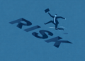
Ask your brand the right questions – Who do you want to be? Funny, Quirky, Serious, Authoritative, or want to be a fresh blend?
![]()
![]()
Fig.1
Colour
Brand success is not painted in any single color but why not just “Play safe?”
Choosing the right color is important for your logo. Just a sketchy thought, wearing a red bodycon dress to someone’s funeral. Well pun intended – How many graphic designers does it take to create a logo? “None, they’ll just spend 10 hours debating the ‘perfect’ shade of blue.”
Moving on to the next element, well said “Colors are the silent ambassador of the brand”. Every color tries to set a brand narrative based on the human emotion it triggers. A Canva research reveals the most popular colors used in Fortune 500 brands are blue, red, yellow, purple, green, black, and white. Let’s understand color psychology.
- Blue: Evokes Trust, reliability, calmness, professionalism and security
- Red: Red ignites feelings of excitement, energy, passion, and urgency
- Yellow: Yellow can be an optimistic, positive, and warm affair
- Purple: Purple is all about creativity, luxury and mystery
- Green: Green is for growth, nature, health and sustainability
- White: White is more of an innocent, pure, and peaceful kinda thing
After all color selection is like a relationship, It’s all fun until you realize you have to commit.
Simplicity
Why did the complex math problem get jealous of the simple one? Because the simple one always got the attention!
Blah blah blah… Adding too many details to a logo can result in a design that’s overwhelming and less effective. A logo’s primary purpose is to be simple, memorable, and easily recognizable. When too many elements are incorporated, it can create visual clutter and make it harder for consumers to quickly identify the brand. Bored, with all that jazz right? When it comes to designing the logo the core mantra should be “KEEP IT SIMPLE SILLY”.
Human Connect
I tried to have a deep conversation with a logo… But it just gave me a lot of empty space!!!
The last but most important aspect of designing a great logo is Human Connect; the brand should instantly ignite a spark between ROMEO (brand) and JULIET (consumer), well you either “IMPRESS” or get a “LEFT SWIPE”. Now that we have established the don’ts, let’s understand some Do’s.
The Glory
The beauty of visuals is they are quite self-explanatory
- FedEx Logo: The FedEx logo fully demonstrates the use of negative space. See the arrow between the uppercase “E” and lowercase “X”? The lettering is more than a wordmark; it is a creative combination of two blends of two different fonts (typefaces) to create a unique and creative visual identity. The logo’s design has won several awards.
![]()
![]()
Fig. 2
- BMW logo: The central part of the BMW logo symbolizes the rotating blades of an airplane which depicts the company’s early history of aviation technology.
![]()
![]()
Fig. 3
Conclusion
Designing a logo is not just about creating a good visual effect but it comes with a long-term goal of building a human connection, value, and personality with the brand. Thorough market research should be done before introducing your brand’s logo because-
A Logo for a brand is the signature of an artist.
In branding, human connection should never be a lost art. Human beings always try to find a matching frequency, what makes you think this wouldn’t be the case in choosing the right brand for yourself?
- Don’t fall into this trap where, If your brand says Trustworthy, your logo says Run Away!
- Your logo should make you say “wow” not “huh”?
A brand logo should be most importantly “relatable” above anything else.
Learn how to create a memorable and impactful logo that truly connects with your audience. Dive deeper into the art of branding on IMPAAKT!